

Filipinas Artesanias
Concept · never launched
A Filipino handcraft house with 70 years of history, and a full storefront concept built to feel as warm as the work itself and to grow as the catalog does. Designed in full, never launched. Shown here as a design piece, with the owner's permission.
View the demo →Note: the demo is filled with placeholder content. The product names, prices, and testimonials are stand-ins used to build and test the layout. They aren't real products or real customer reviews.
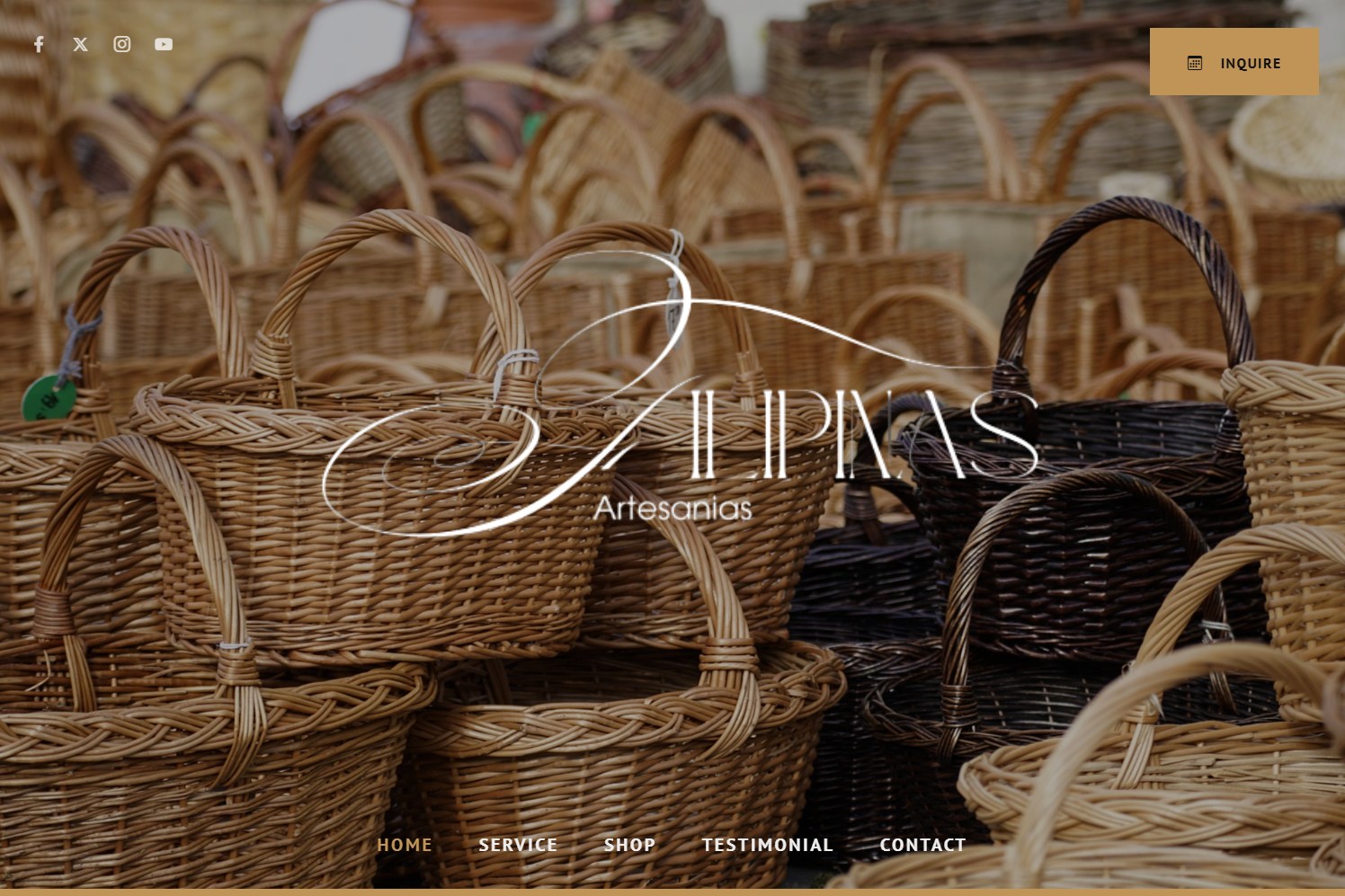
Craftsmanship that a generic template would flatten.
Filipinas Artesanias has spent more than 70 years making handwoven baskets, rattan, and artisan goods. The craftsmanship is the value, and craftsmanship is exactly what an off-the-shelf store template flattens into just another product grid.
They needed a storefront that carried the warmth and heritage of the work, made products easy to browse and buy, and could keep growing without the design falling apart.
Let the products be the hero; let the design get out of the way.
-
Warm, product-forward art direction
Earthy tones, generous white space, and a script wordmark. The design steps back so the handwoven textures and real photography carry the page instead of competing with it.
-
A shop that's ready to sell
Clean product cards with clear pricing and a sale badge, laid out so browsing feels calm instead of cramped. That's the difference between a catalog you scan and one you shop.
-
Told the 70-year story
An "about" rooted in the history, and a "how we work" built on quality, longevity, and service. For handmade goods the story is half the reason people buy, so I gave it real room instead of a footnote.
-
Structured to scale
The catalog runs on a repeatable card system, so new products drop straight in without breaking the layout or the rhythm of the page as the shop grows.
-
One clear path, start to finish
About → how we work → shop → testimonials → FAQ → location, so a first-time visitor moves from curious to contact without hitting a dead end.
A storefront that shops well in one hand.
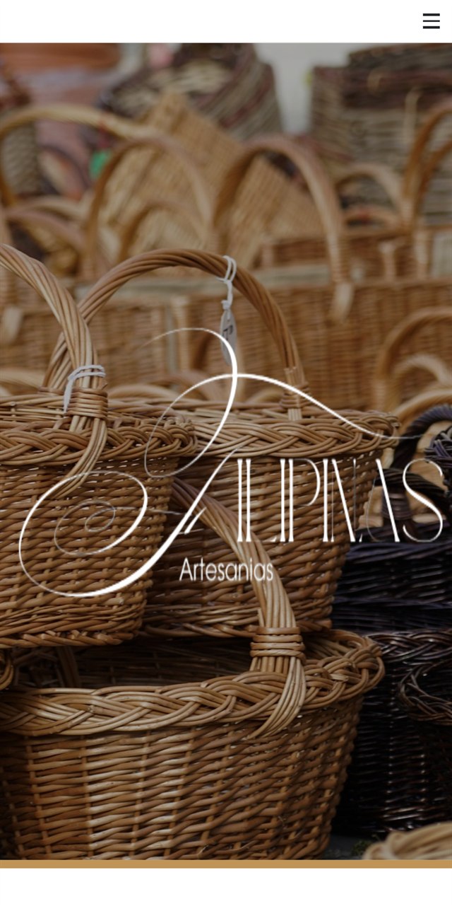
Product cards stack into one clean column and the imagery stays generous, so browsing on a phone feels as considered as the products themselves.
Finished, and ready if she ever changes her mind.
The storefront was designed and built end to end: every section, the full product grid, desktop and mobile. It was never launched, so there's no traffic, no sales, and no rankings to report. I'd rather show the work honestly than dress it up.
It's here because the thinking stands on its own: how to give a heritage brand room to breathe, make handmade goods easy to shop, and structure a catalog that can grow without breaking.